Responsive Web Design with Wix Studio & AI — 2026 Guide
Responsive Web Design with Wix Studio & AI — 2026 Guide
Responsive web design today is about more than screen sizes. It’s about clarity, hierarchy, and making sure content remains discoverable and meaningful whether someone sees your site on a desktop, tablet, phone, or an AI-driven search system. I’ll walk through a practical approach to responsive design using Wix Studio and explain how built-in AI can speed up the process while preserving your original layout and intent.
Why responsive design matters now
Mobile usage, accessibility rules, search engines, and AI content systems all rely on structured, readable pages. When a layout simply “shrinks” to fit a smaller screen, heading hierarchy, spacing, and content priority can break. That harms user experience and makes it harder for machines to understand what your page is about.
Good responsive design preserves hierarchy and clarity: headings still make sense, body text remains readable, and the most important information stays visible across devices.
How Wix Studio approaches modern responsiveness
Wix Studio treats responsiveness as behavior, not just sizes. Instead of locking you into rigid templates, it lets you control how layouts behave across breakpoints—how spacing adapts, how elements group, and how priorities shift when screen real estate changes.
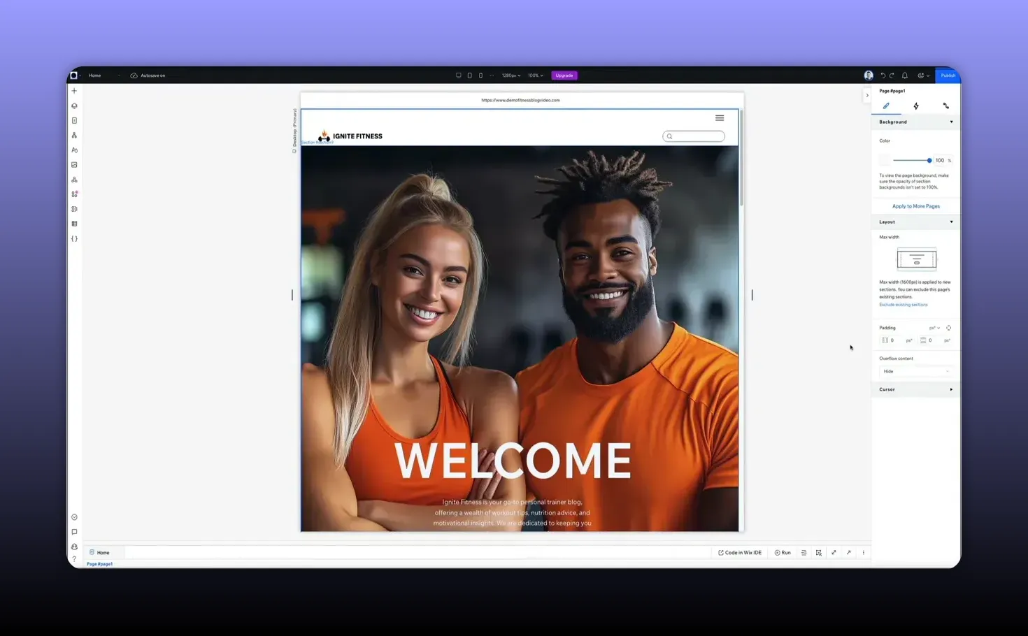
There are a few straightforward ways to work with responsive layouts in the editor. A quick starting point is switching to mobile preview to identify problem areas before editing.
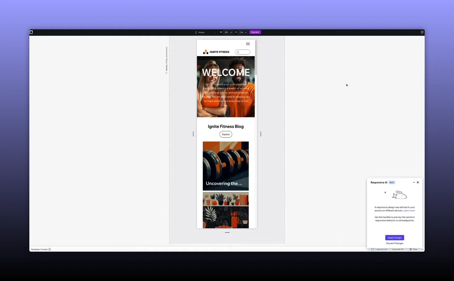
Responsive AI: convert complex layouts instantly
One standout feature is responsive AI. Click anywhere on the page to open the contextual toolbar, then trigger the responsive AI icon. Wix Studio analyzes spacing, groups related elements, and applies responsive logic so your design adapts intelligently across breakpoints.
The AI takes care of decisions you’d otherwise make manually—stacking, alignment, and spacing—while keeping the original design intent intact. After the transformation you can preview results on specific devices (phones, tablets, etc.) and then apply the design to your site.
Responsive typography and content hierarchy
Text is the backbone of meaning on a page. If the type scale or spacing collapses on mobile, the page’s message can be lost. Wix Studio provides controls for responsive typography so headings, subheadings, and body text scale and reflow correctly.
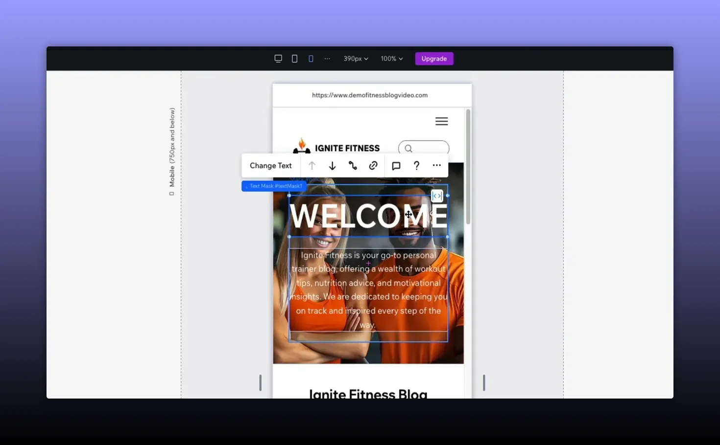
Adjust width, alignment, and scaling visually inside the builder rather than guessing with code. That ensures your content hierarchy remains consistent across devices—a critical factor for both accessibility and how AI systems identify key topics on the page.
Practical workflow: preview, fix, apply
Here’s a simple, effective sequence to follow when making a site responsive:
- Preview on target devices: Start with mobile preview to spot obvious issues like oversized hero images or overflowing elements.
- Run responsive AI: Let the AI analyze and apply responsive rules. Inspect the changes and tweak as needed.
- Fine-tune text and elements: Select text blocks and large elements (forms, galleries) to adjust width, alignment, and scaling.
- Apply and review: Click apply design, then test across several devices to confirm the experience and hierarchy are intact.
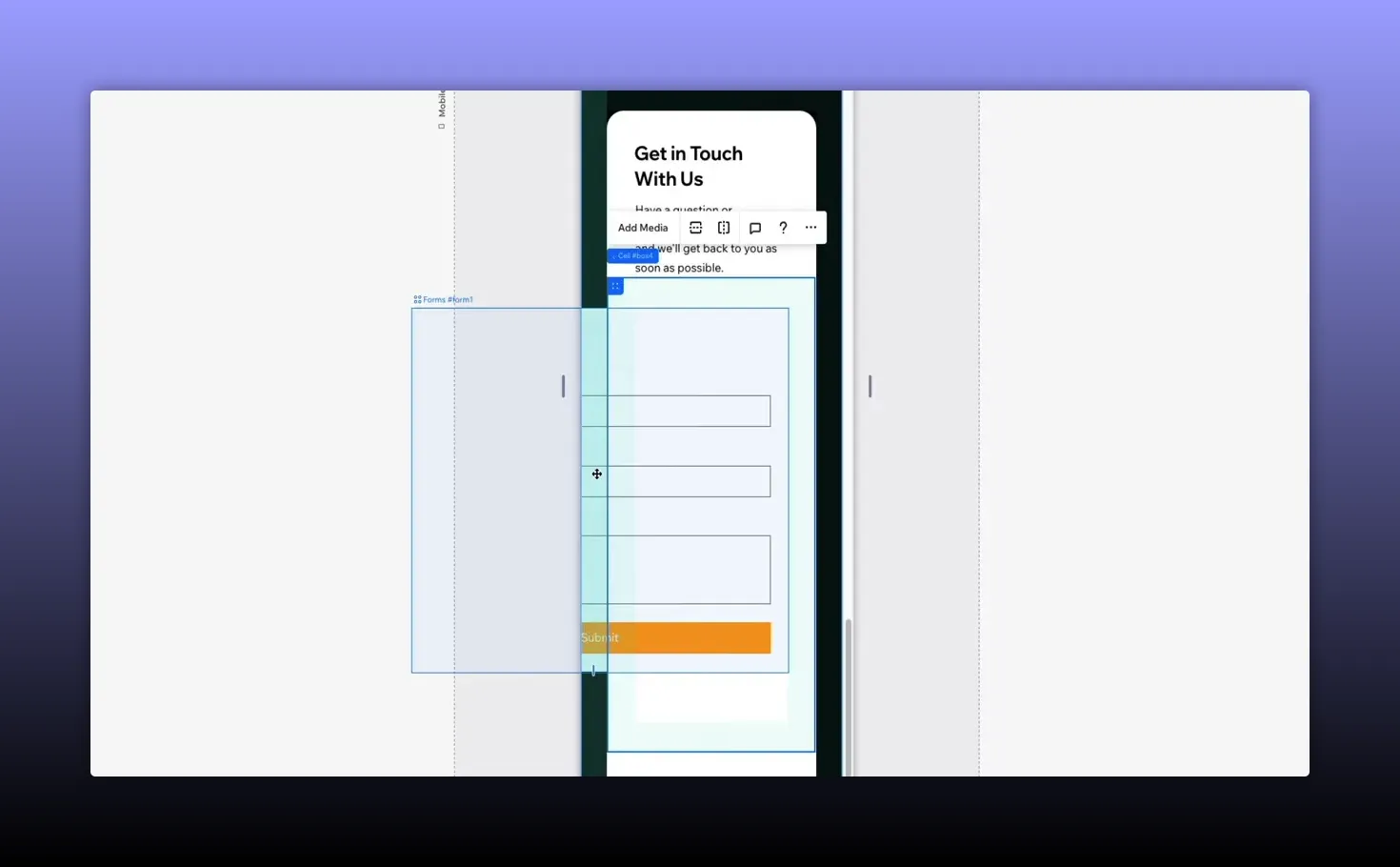
For example, if a contact form bleeds off the edge on mobile, simply select the form and adjust its fit. No CSS edits or manual breakpoint juggling—drag, drop, and let the system handle spacing and alignment behind the scenes.
Mobile-first without losing what matters
Designing for smaller screens doesn’t mean stripping content away. A mobile-first approach should preserve the site’s core information. Instead of hiding sections, adapt layouts so key content remains accessible on every device.
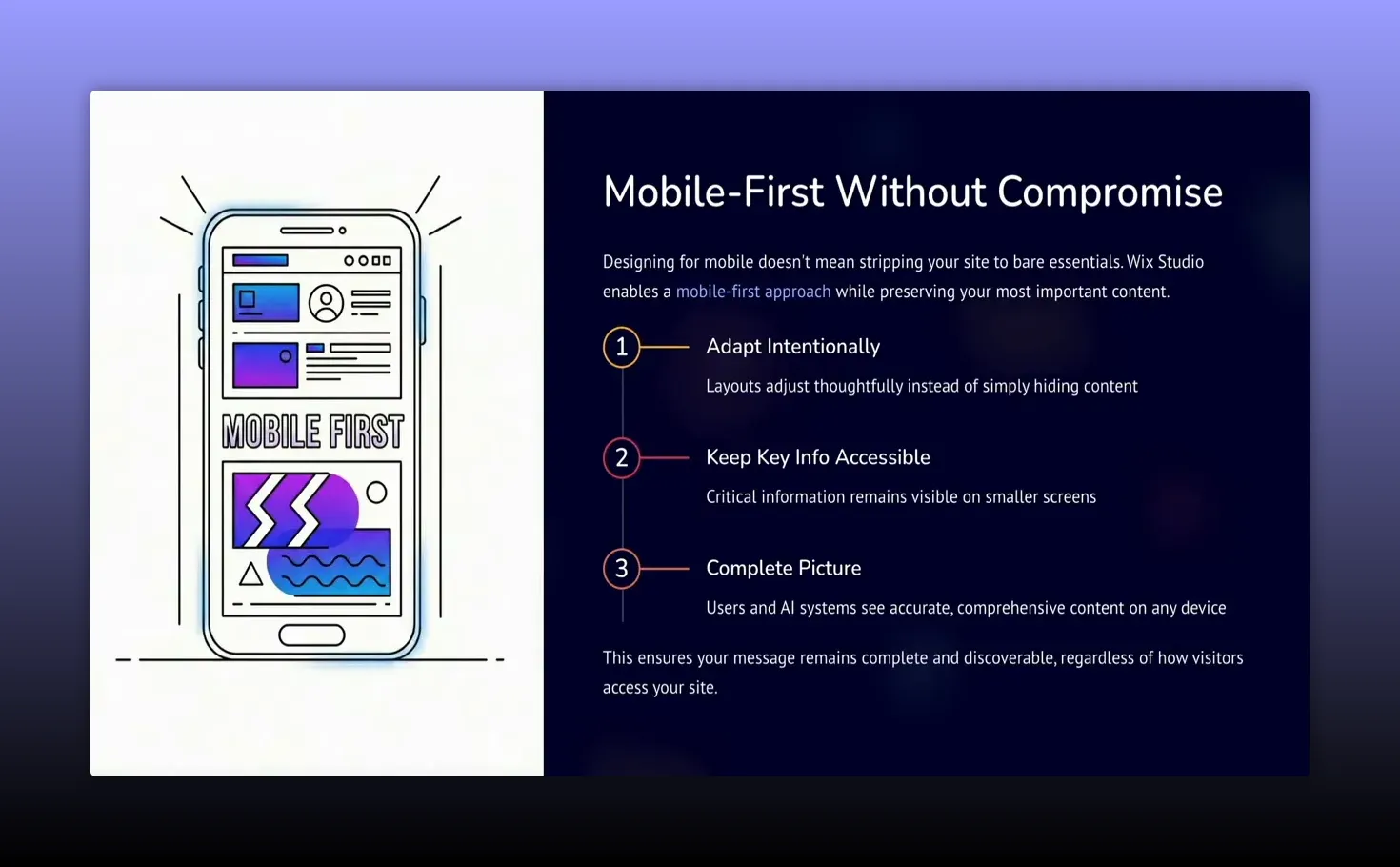
That approach ensures users and discovery systems see a complete, accurate picture of your content, which improves accessibility, search performance, and the likelihood that AI-powered tools will recommend or summarize your pages correctly.
Why this matters for the future of the web
As AI-powered search and content discovery grow, the structure and clarity of pages will become even more important. Pages that are clean, readable, and organized across devices are easier to interpret and recommend. Responsive design is no longer purely visual—it is foundational to how content travels across the web.
Wix Studio’s combination of flexible layout controls and responsive AI positions sites to scale with these changes. It helps designers and creators spend less time rebuilding and more time refining content and user experience.
Quick checklist before you publish
- Preview on multiple devices and specific phones or tablets.
- Run responsive AI and review grouping/spacing decisions.
- Adjust responsive typography to keep hierarchy clear.
- Fix any overflowing elements like forms or images.
- Confirm that important content remains visible and accessible.
Responsive design in 2026 is about flexibility, clarity, and future-proofing content for humans and machines. Use tools that respect your original design while helping your pages stay structured and readable wherever they appear.
If you want to experiment with these ideas, try converting a few existing sections with responsive AI, then test how headings and body text behave across devices. It’s a fast way to see the real-world impact of well-executed responsive design.
Responsive web design today is about more than screen sizes. It’s about clarity, hierarchy, and making sure content remains discoverable and meaningful whether someone sees your site on a desktop, tablet, phone, or an AI-driven search system. I’ll walk through a practical approach to responsive design using Wix Studio and explain how built-in AI can speed up the process while preserving your original layout and intent.
Why responsive design matters now
Mobile usage, accessibility rules, search engines, and AI content systems all rely on structured, readable pages. When a layout simply “shrinks” to fit a smaller screen, heading hierarchy, spacing, and content priority can break. That harms user experience and makes it harder for machines to understand what your page is about.
Good responsive design preserves hierarchy and clarity: headings still make sense, body text remains readable, and the most important information stays visible across devices.
How Wix Studio approaches modern responsiveness
Wix Studio treats responsiveness as behavior, not just sizes. Instead of locking you into rigid templates, it lets you control how layouts behave across breakpoints—how spacing adapts, how elements group, and how priorities shift when screen real estate changes.
There are a few straightforward ways to work with responsive layouts in the editor. A quick starting point is switching to mobile preview to identify problem areas before editing.
Responsive AI: convert complex layouts instantly
One standout feature is responsive AI. Click anywhere on the page to open the contextual toolbar, then trigger the responsive AI icon. Wix Studio analyzes spacing, groups related elements, and applies responsive logic so your design adapts intelligently across breakpoints.
The AI takes care of decisions you’d otherwise make manually—stacking, alignment, and spacing—while keeping the original design intent intact. After the transformation you can preview results on specific devices (phones, tablets, etc.) and then apply the design to your site.
Responsive typography and content hierarchy
Text is the backbone of meaning on a page. If the type scale or spacing collapses on mobile, the page’s message can be lost. Wix Studio provides controls for responsive typography so headings, subheadings, and body text scale and reflow correctly.
Adjust width, alignment, and scaling visually inside the builder rather than guessing with code. That ensures your content hierarchy remains consistent across devices—a critical factor for both accessibility and how AI systems identify key topics on the page.
Practical workflow: preview, fix, apply
Here’s a simple, effective sequence to follow when making a site responsive:
- Preview on target devices: Start with mobile preview to spot obvious issues like oversized hero images or overflowing elements.
- Run responsive AI: Let the AI analyze and apply responsive rules. Inspect the changes and tweak as needed.
- Fine-tune text and elements: Select text blocks and large elements (forms, galleries) to adjust width, alignment, and scaling.
- Apply and review: Click apply design, then test across several devices to confirm the experience and hierarchy are intact.
For example, if a contact form bleeds off the edge on mobile, simply select the form and adjust its fit. No CSS edits or manual breakpoint juggling—drag, drop, and let the system handle spacing and alignment behind the scenes.
Mobile-first without losing what matters
Designing for smaller screens doesn’t mean stripping content away. A mobile-first approach should preserve the site’s core information. Instead of hiding sections, adapt layouts so key content remains accessible on every device.
That approach ensures users and discovery systems see a complete, accurate picture of your content, which improves accessibility, search performance, and the likelihood that AI-powered tools will recommend or summarize your pages correctly.
Why this matters for the future of the web
As AI-powered search and content discovery grow, the structure and clarity of pages will become even more important. Pages that are clean, readable, and organized across devices are easier to interpret and recommend. Responsive design is no longer purely visual—it is foundational to how content travels across the web.
Wix Studio’s combination of flexible layout controls and responsive AI positions sites to scale with these changes. It helps designers and creators spend less time rebuilding and more time refining content and user experience.
Quick checklist before you publish
- Preview on multiple devices and specific phones or tablets.
- Run responsive AI and review grouping/spacing decisions.
- Adjust responsive typography to keep hierarchy clear.
- Fix any overflowing elements like forms or images.
- Confirm that important content remains visible and accessible.
Responsive design in 2026 is about flexibility, clarity, and future-proofing content for humans and machines. Use tools that respect your original design while helping your pages stay structured and readable wherever they appear.
If you want to experiment with these ideas, try converting a few existing sections with responsive AI, then test how headings and body text behave across devices. It’s a fast way to see the real-world impact of well-executed responsive design.

Written by Ben Cummings
Founder of blogwithben.com
Ben is the Co-Founder of Sage Wave Media, LLC which is the parent company of Blog With Ben. He enjoys teaching, blogging, startups, a hoppy IPA, and college basketball. Whenever he's not blogging, you can find him cruising around sunny San Diego with his amazing family.
0 Comments